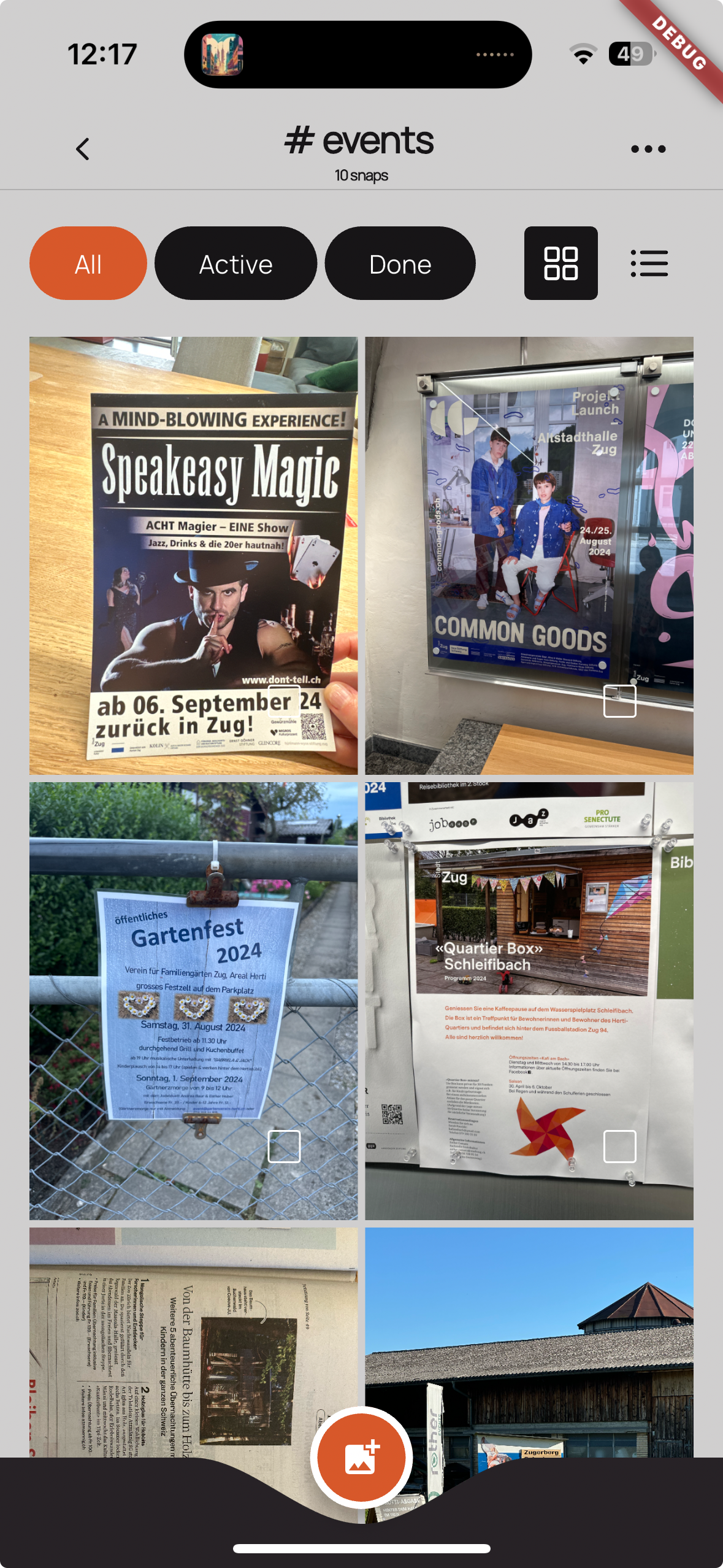
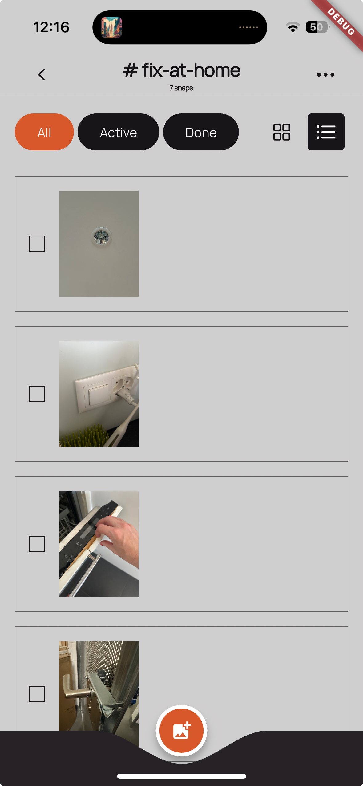
This post has two threads in the story, one is about how I wanted to learn to build a product from scratch outside of the context of Big Tech and the other one is about solving my problem of having 100s of photos on my phone that I took to remember something (like events, gift ideas) that I end up forgetting.
Exercising my Product Muscles.
Let’s start with the first part: my career so far was mostly in research, starting out in academia and then in research departments of big tech companies. While I’ve always been very product and research transfer focused, seeking out opportunities to work as closely as possible with people on the product side, I never had to actually take on the actual responsibility to launch a product. Driven by the desire to have impact on the mundane everyday life of people, I wanted to start exercising my product muscles independently. But transitioning from coming up with big ideas for a corporate research environment to a one-person operation meant adapting to limited resources and focusing intensely on a simple, manageable project. So I established clear goals:
- Choose a small, extremely clear scope to exercise those product muscles
- Ensure the project remains resource-efficient and doesn’t consume my resources (money as well as time.)
- Accept that the worst case might be creating the most expensive app I’ve ever bought for myself.
Eureka! Selecting an Idea.
This takes me to the second part: the winning idea became clear when I found myself taking yet another photo of something I saw in a shop window as a gift idea and thinking, ‘well, I’ll forget this photo anyways’. Realizing my photo library overflowed with forgotten photos and screenshots solidified selecting that idea. Even though goal #3 allowed me not to overthink whether there’s a big enough market for such an app, my research instincts kicked in wanting to do a “toothbrush test”, and a user survey confirmed that this is actually a common problem and revealed several typical categories. If you’re interested, here they are:
- Wishlists and Ideas. Most take screenshots of things online, like inspiration for your home 🏠, a wishlist of things you want to buy 🛍️, or activities and experiences you want to do 🎟️. I do the same thing and always find it kind of ironic to “flatten” the information to pixels. This research paper is talking about the meaning and importance of screenshotting which is still an underexplored area.
- Personal Reminders and Records. Often reference photos of things that require an action (like things that need to be replaced or fixed 🔧). Another subcategory is more about collecting, archiving, or documenting things, like photos of their kids’ paintings 🎨, receipts 🧾, or proof of payment 💳.
- Locations and Events. Lots of mentions of time-sensitive information like details for events that are coming up 📅, but also specific locations or information related to an upcoming trip 🗺️.
- Sharing with Others. About 1/3 of people mentioned taking a screenshot/photo to share with others or on social media 📱. From things to watch together 📺, to funny little memes 😸, to insightful Twitter threads to share on LinkedIn 🌐.
Toothbrush Test
The “toothbrush test” method, coined by Google’s former CEO Larry Page, is a simple criteria used to evaluate potential projects or products by asking whether they solve a problem or improve daily life as reliably as a toothbrush, which is used twice a day. This metaphorical test helps in assessing the practical and frequent usability of a new idea, ensuring the product is relevant and frequently needed.
From Prototype to Product.
At that point I had more than enough context to get started and set up the user flows and the initial UI design in Figma. I wanted to make sure it has enough functionality to support those different categories, such as offering to-do list and reminder capabilities, and the ability to share tags with others.
Creating the first clickable mockup made it clear I couldn’t build this alone without going against goal #2, being conscious about my resource of time. So after setting a modest budget, I wrote a job description and selected a freelance developer through Upwork. Although initially anticipated to take three months, development stretched to six, and the process was quite tricky. It was a big change to go from working in a fixed team with aligned expectations to working with someone on a contract base.
Nonetheless, an MVP was created and I got a few test users, making me decide to invest further into the project and truly viewing it as part of my entrepreneurial learning journey. At this point my own design felt a little outdated to me and this time I had more luck via Upwork and found an amazing designer to help me update it. And now I also knew better what are important criteria for me in a freelance developer and going through personal recommendations for a local agency I found a senior developer in the Ukraine I now happily work with. This revamp of the design and finding a more compatible developer finally pushed the project forward more effectively.
Eating your own Dog Food.
Being able to use SnapTag myself daily now, I started improving its UI/UX and functionality. I knew it in theory how important it is to not give in to temptations of feature creep and adding more and more to it, but it’s another thing to do it in practice to just focus relentlessly on a product’s core value (in this case being a visual reminder tool.) And unsurprisingly, in my personal use the above mentioned categories like time-sensitive events kept on coming up making it one of the main tags I’ve been using.

And while the ever-growing list of things we need to fix in our home is less exciting, it also became a go-to tag because it’s an example of “a picture is worth a 1000 words.” I’d never add this to a todo list if I had to think about how to describe the task at hand when the photo says it all.

Ticking the Boxes.
I’ve learned so much and to stick with the metaphor: I could feel my “product muscles” gaining strength and the scope of the project stayed quite narrow, so I’m excited to tick off goal #1. Just about these days, I’m hitting my defined budget (but decided to expand it a bit more to see it all the way through), so let’s call that asemi-check on goal #2. Since I now use the app myself on the daily, I can confidently tick off goal #3 as worst case, SnapTag will simply be the most expensive app I bought for myself.
So, the next milestone is to take it out of TestFlight and into the App store while still in Beta. I started prepping it for a wider release, learning about monetization models, marketing strategies, and user communication as well as what tools or services support them. If you’re interested in trying SnapTag out yourself, sign up here or ping me directly.